Saturday, March 2, 2019

Photo2Q3.3: Group Portrait Practice

I've never been the type of photographer to take group photos. Since I've stuck with using a f/1.8 50mm for a large majority of my photographic career, I didn't feel the need to expand beyond that. When practicing in class, I was working independently and to be honest, it was interesting, but skewed. I worked with all of these people in some way or know them somehow, so it was pretty easy to "talk" to all of them. We all have a shared passion for photography, so we all understood what was going on. Much of this wouldn't necessarily translate to real-world group photography. Still, it was great to have control over a situation and ask people to pose a certain way or to move here or there. It felt as if I was truly modeling people, just on a smaller scale.


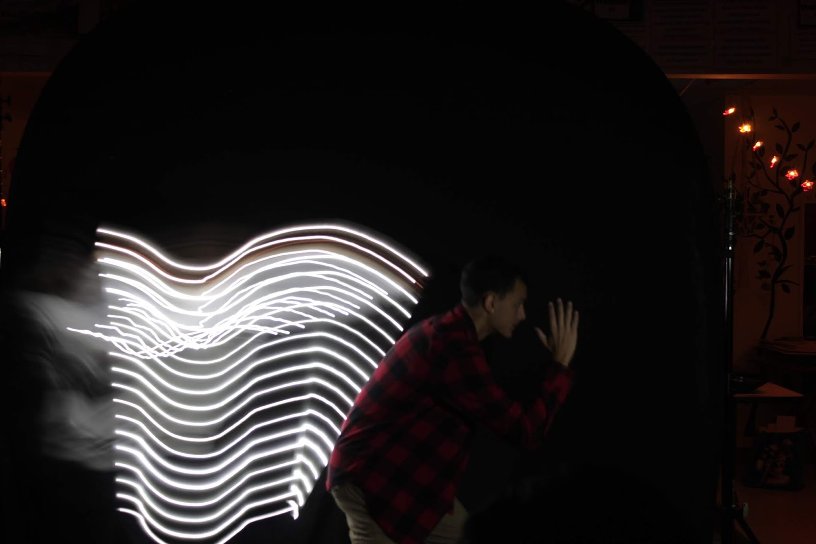
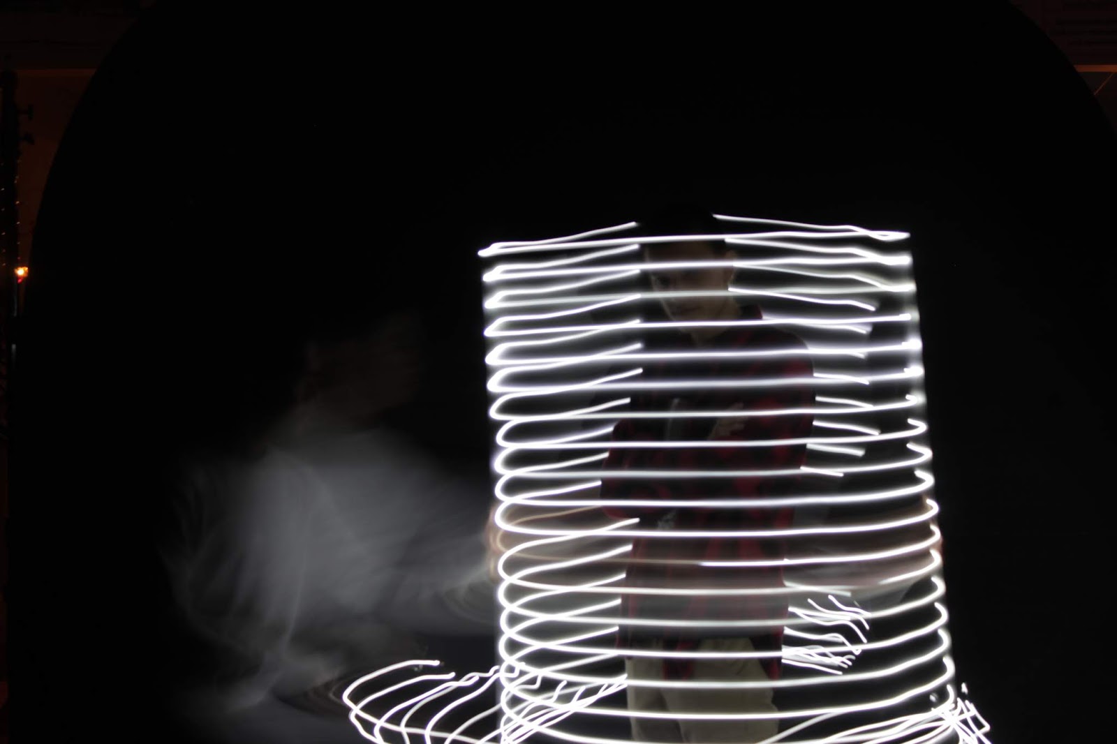
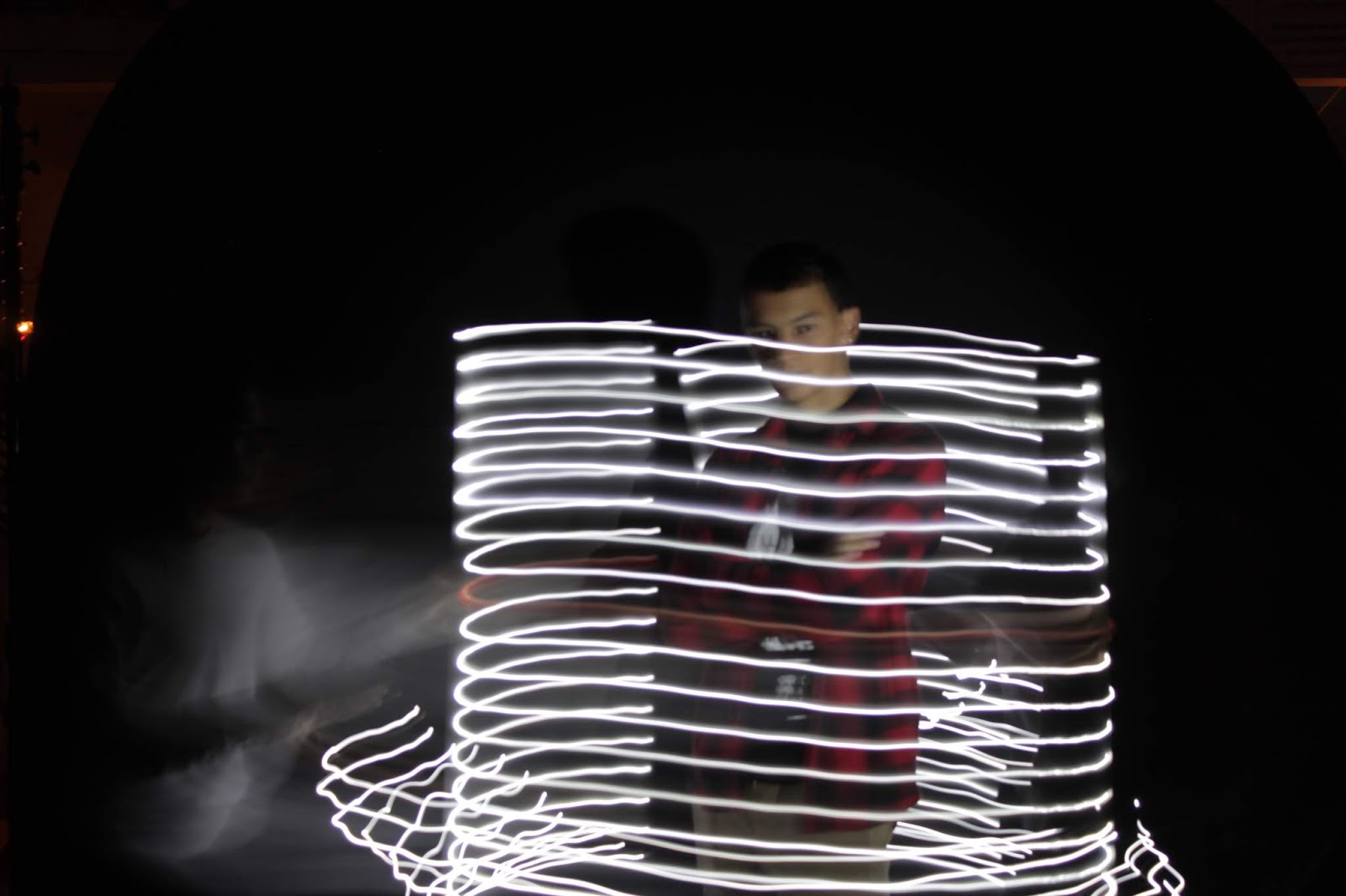
Due to unforeseen circumstances, these are the only BTS photos we have. Perhaps the greatest difficulty was getting the proper lighting that would fit all individuals in the photo. It's a lot easier when you're photographing 1-3 people, but once that group grows, the light has to hit each face in just the right way. Having harsh shadows definitely doesn't help (this is where flash comes in to fill in those shadows, but I still dislike the harsh look of built-in flash). However, finding the location was relatively easy as we have a lot of beautiful spots on campus.


Thus, when planning for the actual group portraits for the senior homerooms, I think it'd be advantageous to A) Find locations that have beautiful settings but are balanced with lighting that's easy to work with, and to B) Not be afraid to command people and directly talk to them to get their positioning right in the photo.

Thursday, February 28, 2019

Photo2Q3.2: Pow Wow 2019

Pow Wow is a wonderful opportunity for artists to come down to various places around the world and to just create. Sure, it's quite typical for the artists to only paint murals and such, but in recent years that has changed. We've seen different mediums emerge (the wire guy from last year) as well as controversial and highly intriguing new concepts from up and coming artists (like Tran Nguyen). Hawaii has always been known for being a melting pot of culture as well, so it's wonderful to have top artists in the international world merge ideas with artists local to Hawaii. Jasper Wong has done a great job in bringing together the right types of people together to create a spectacle in Kaka'ako, a place whose change I've personally witnessed (from a homelessness hot spot to a colorful [albeit gentrified] area for creatives).

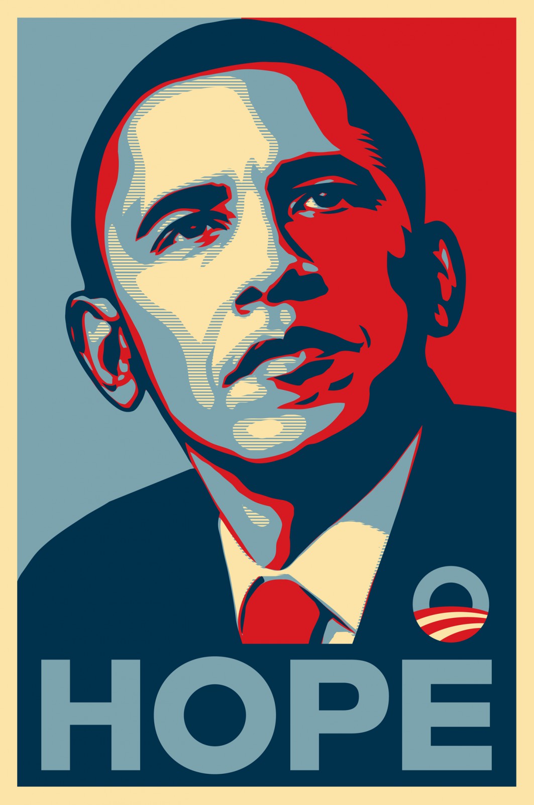
Shepard Fairey
Image result for obama hope poster original
Shepard Fairey

I plan on going to Pow Wow on a couple separate occasions with my friends to check out the artwork there. As we all know, the great Shepard Fairey is going to be there, so I'd definitely like to check his work out while I'm there. I respect his work for Obey and the famous "Hope" poster featuring Barack Obama.

How Nosm

How Nosm

When I look at their artwork, I am reminded of multiple themes that merged together, which I'll title: Abstract, Japanese, and psychadelic geometrics and aesthetics in a outrun landscape, complimented by vaporwave-esque colors. I've never seen such a wide array of themes merged together in such a unique way. I love their pieces and I hope to see it at Pow Wow.

Amy Sol

Amy Sol
In a lot of ways, Amy Sol's work reminds me of Tran Nguyen from last year. It's got this interesting realism aspect, but explores fantasy themes and colors. Her color palette in her artwork is on the duller side, but it works so well to her artwork. I'm intrigued to see how this will translate to Pow Wow Hawaii, where the canvas will be much larger than what she's often working with.

Friday, February 22, 2019

Photo2Q3.1: Small Aperture

2a Daytime Suburst
2b Daytime Sunburst

1a Collaged sunburst (?) aperture run
3a Nighttime sunburst
3b Nighttime sunburst

Monday, January 7, 2019

Photo2Q2.8: End Q2 Best Photo

This quarter felt more like going through motions, to be honest. There were some interesting projects, but still, the images I feel that are my best are far different from the topics that we explored this quarter, or they don't necessarily relate to it. I would argue that I'm going through a "sophomore slump", or perhaps it's just senioritis, but that would be too generous, as quality production of my photos this quarter reached an all-time low. I am still passionate about photography, but it's just been difficult to find the drive to take photos after my brain gets drilled from everything that's been going on this senior year relating to college and life in general. Next semester, I look forward to changing this. I used to be incredibly productive back in Photo 1, and I hope to continue that for the second semester. No partially completed assignments (hopefully). In fact, I purchased this app called Tick Tick, to help organize literally all of my tasks in life and education, so perhaps my production in this class will increase as a result.

But I digress; these are all personal difficulties. In photography, I look forward to the studio lighting and Pow Wow. These two seem very intriguing, and I want to take advantage of my last year in this class. Instead of succumbing to senioritis, I want this semester to be all about putting the "cherry on top"; finishing strong.


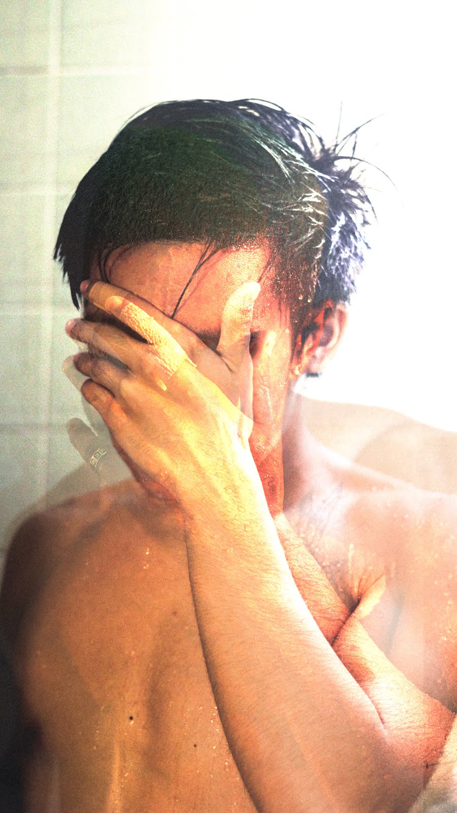
Okay, not gonna lie, this best image was taken in priority over my slow shutter project. I was doing one concept for that project and I was like "man, I really want to recreate the Frank Ocean "Blonde" album cover. A mini ITSO that I never got to do. I photoshopped an overlay of the actual cover onto my replication of it (you can see the green hair merging in the middle). I like this the best amongst all the other images I've taken thus far because it has a lot of personal meaning. That album came at a time where I was quite broken, and at a time that I considered split my life from adolescence and maturity; a coming of age. I still listen to it today because of the vast array of emotions and messages it carries.


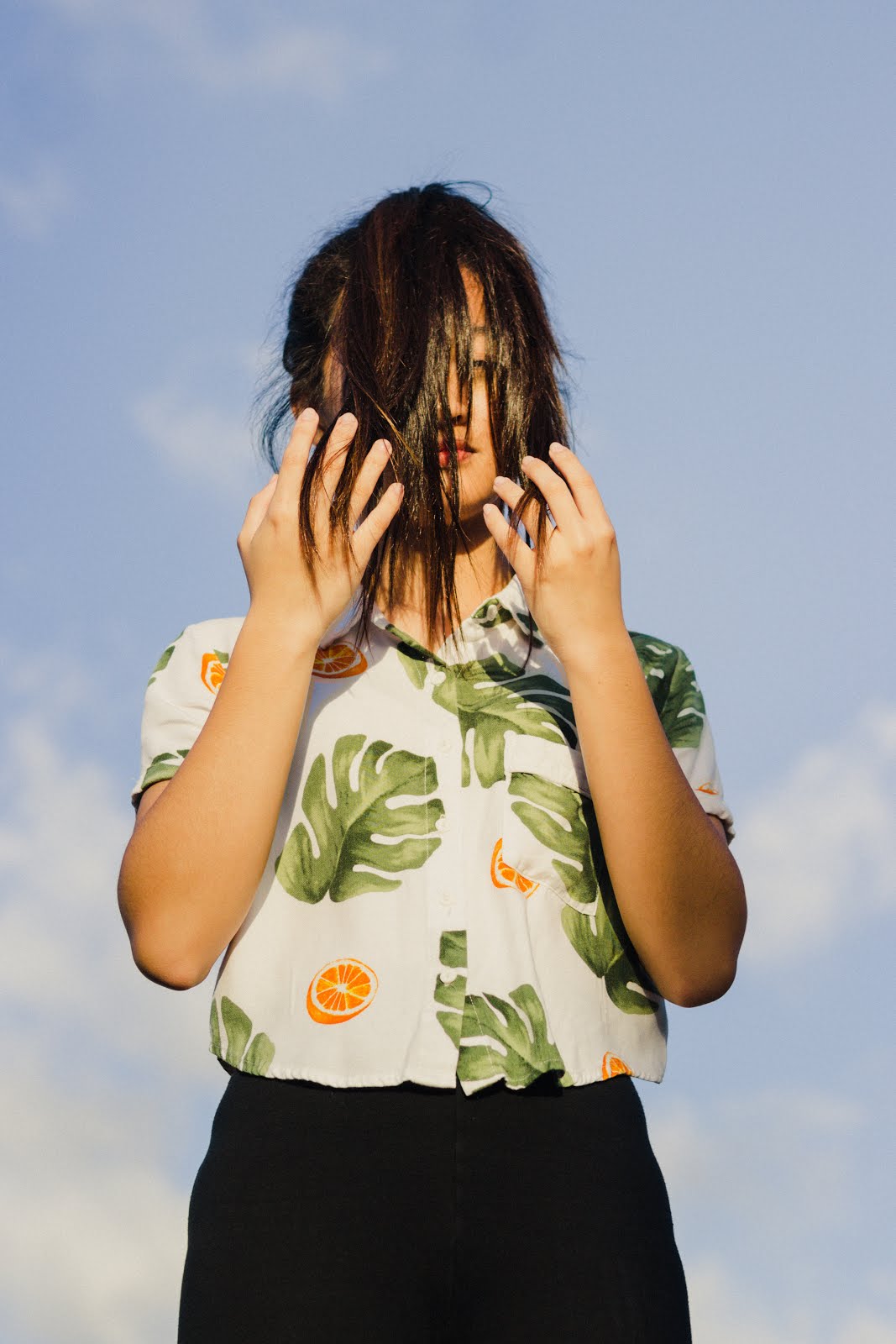
This free choice photo is of Britney Cabuhat, a close friend of mine. We were doing this spur-of-the-moment photoshoot at school while we were waiting for the Winter Concert from SO. I based this off of an image I found online a while back and asked her to do the same pose.


This second free choice image was one of my fast shutter concepts. I just found the food coloring to be incredibly neat, and it's something I've never seen in person. I still have the food coloring today and I'm quite honestly thinking of doing another photoshoot with that same food coloring just to try and see the different color combos I can get.

Thursday, January 3, 2019

Photo2Q2.7: Multiple Pinholes

No prism for the two
(From left to right, top to bottom)

1: Portrait against wall. Single pinhole. Light was undesirable and conflicted. Some clear light leaks on the side as shown, likely due to poor camera tape applications, but was fixed later.
2: Portrait against staircase-side of F building, top floor. Single pinhole. Light was undesirable and conflicted. Same problems.

1, 2, 3: No prism. 4, 5,6: Prism
Working with camera obscura and the pinhole camera was somewhat difficult. I am conditioned to using Lightroom to manipulate my raw images, which has led me to care less about whether I get my exposures correctly when I shoot. I always think "just so long as it's somewhat accurate it'll be fine". The same cannot be said about pinhole cameras, or film cameras in general. This challenge was a tough one to face because of how adapted I was to DSLR's and the small range of knowledge I possessed for pinhole photography.

(From left to right, top to bottom)

1: Rylen as subject posing against wall. Multiple pinholes (6). Light was bountiful; I attribute the overexposure largely to having too long of a shutter time.
2: Self portrait against rail. Multiple pinholes (6). Plenty of light; long exposure time was a clear problem, so I reduced in small increments (which is why they appear to get better as it progresses).
3. Unknown, likely a wall portrait. Multiple pinholes (6). Overexposed.
4. Unknown, also likely a wall portrait. Multiple pinholes (6). Very overexposed and likely out of position because I can barely make out a shadow of a person against a surface.
5. Reynaldo's shoes as he walks down the stairs. Multiple pinholes (6). Lighting was plentiful, but exposing in a dark area seemed to counteract that effectively. I enjoy the better exposure here, but the position is somewhat awkward and has a slight dutch angle to it that doesn't really add to the photo.
6. Self portrait sitting on the wall outside the classroom. Multiple pinholes (6). Somewhat clouded, but overall bright day. This is probably the best exposed image of the bunch. Yes, there is a slight dutch angle to it, but the fact that it was exposed so much better than the rest made it desirable.

Pinhole photography has a lot of opportunities for combinations of exposures. The prism effect can be desirable, yes, but I feel that what's more desirable is combining multiple different images onto the same canvas instead of the same repeating image.


Wednesday, January 2, 2019

Photo2Q2.6: Slow Shutter

Thumbnail
As a primarily people-photographer, I had pretty little experience in slow shutter photography. It's simply not my cup of tea. I like having freedom when I shoot. By that, I mean freedom of movement; I dislike having to be attached to a tripod, which is what, a majority of the succeeding photos in this post consist of. I tried to do what I could based on what I knew. Researching for this was a little bit more difficult since I interpreted a lot of what I saw on Pinterest and Google images as being too difficult to replicate because of how precisely I needed to have the conditions meet. That may be a lack of effort, or just being afraid of trying something new, but I digress.

Brainstorm slide
Brainstorming in class was helpful in bouncing ideas off of each other. I realized that one of my concepts was basically like leaving everything up to chance and having little personal artistic effort (10-30sec concept).

Concept 1 (1/60-.5sec):  1/2, f/10, and ISO 100
Concept 1 (1/60-.5sec) 1/40, f/10 and ISO 100
For this first concept, I just wanted to capture nature; nothing super thematic. I was hiking and unfortunately had no tripod to mount my camera on. Still, I attempted to shoot the stream as described in my brainstorm slide. There was no waterfall anywhere really, so I settled for these small drop-offs in the stream. The biggest difficulty here was just the sheer amount of camera shake. I was really trying not to drop my camera into the water, so I held onto it tight (which unfortunately caused the extra camera shake as shown). In the future, I'd bring something like a mini tripod or a gorilla pod.

Concept 2 (1-5sec) 3s, f/8, and ISO 100
Concept 2 (1-5sec) 2s, f/7.1, and ISO 400
For the second concept, I wanted to recreate Frank Ocean's Blonde album cover with a little twist of slow shutter to it. In retrospect, perhaps using a variety of angles and having actual sub-concept variations would've made this better. The difficult part of this was getting in and out of the shower and having to deal with freezing every time I splashed water on myself.  In addition, the bar itself in the shower was kinda frustrating to deal with, but I tried recreating the cover with my 50mm without slow shutter and it turned out fine. Perhaps asking someone to shoot for this one or trying another concept in general would've been preferable.

Concept 3 (10-30sec) 15sec, f/4, and ISO 100
Concept 3 (10-30sec) 15sec, f/4, and ISO
Perhaps my weakest concept because I deviated so much from my original brainstorm plans, I was at a party at the time and thought that the place they used was interesting, because they had a church with this unique upper part to it. Some editing got the yellowish hue it originally had due to surrounding lighting, but it persists. Having the moving clouds is indeed interesting, but if I were to reshoot this, I'd definitely use a variety of buildings instead of just one.

Below are some additional photos I gained from the shoot. Some are relevant to the project, some aren't.


In all honesty, none of the concepts were my favorite and I thought that I failed expectations for this project, but if I were to rate them on success level, concept 2, 1, 3. On a scale of 1 to 10 in terms of how confident I am in slow shutter, I think I'm a 4-5. Last time, in the light painting post, I mentioned how I thought that slow shutter was interesting, but as a project I'd do personally, it isn't. In that post I also mentioned that my confidence going in was a 6-7. My reduction in score was due to the apparent lacking in effort and quality in this project, and I realize that. Here's to next quarter/year; doing better in planning and becoming a more responsible student is a primary goal of mine.

Sunday, December 30, 2018

Photo2Q2.5: Light Painting

ISO 200, f/10, 10s
ISO 200, f/13, 4s

ISO 200, f/10, 5s

ISO 100, f/10, 8s

ISO 200, f/10, 8s
I tend to shy away from slow shutter simply because most of the images that I take don't need to utilize a slow shutter. In addition, it creates unattractive images (at least to me) when it's fiddled with, especially in portrait settings. You can usually fix brightness and grain in post production, but you can't really fix motion blur. Still, I am fascinated with some experienced slow shutter concepts, especially when utilized with fluids or star trails, etc.

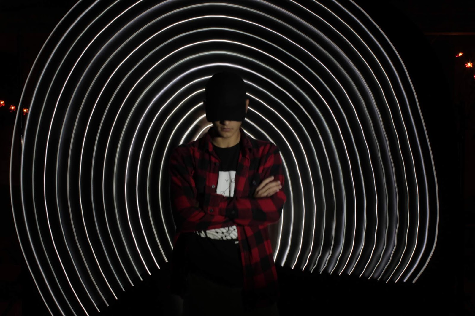
Final image discussion: The last concept we tried was actually developed as a result of me wrapping my fairy lights around this ruler Mrs. Takemoto gave us. It was pretty interesting, and we tried different things like making as if Noah was running (3rd image) or using it as a unique background (1st image). In the final image, we had Noah stand as still as possible while I circled him with the light stick to create a transporter-esque effect. In retrospect, it looked quite cool, but after looking at the image, I just wish there was a way to minimize the blur from Noah moving despite him trying to stay as still as possible.

This in-class experience brings about two primary lessons: Light is important, and ensure that the subject you're photographing is either incredibly still, or you're on an incredibly still surface (that is, unless your subject needs to move). Slow shutter is a lot more reliant on how objects in the frame are moving and the amount of light allotted to you.

Working with peers was interesting. I have nothing against my peers, but for helping me understand slow shutter or inspiring an idea in slow shutter, this was pretty "eh". Yes, it was a new experience, but I just didn't find the exposures to be super compelling. Thus, this in-school practice was a 6-7 on a scale of 1-10. It helped, but not dramatically. Perhaps further independent manipulation of slow shutter will help widen the range of knowledge I have in this field.


Thursday, December 20, 2018

Photo2Q2.4: Bokeh Tasks 2-4

Bokeh Daytime


I felt that I was most comfortable doing portrait shots for this bokeh task. It was easier and recognizable to me, as I enjoy shooting candid portraits over simple objects. At the very least, I would want the object to manipulate with a subject somehow, so that's why I asked Reynaldo to balance his shoe on his hand (as shown above). Ensuring bokeh was in the background was quite easy as I was using a f/1.8 50mm lens. I left it wide open (smaller numbers) and adjusted accordingly. I needed the light to pass through some objects to get that circular blur as seen in the trees in the background of both photos, so I attempted various angles to include all of the necessary elements. I enjoy both of these shots for task 2 because of the obvious reason (candid), but also because they best reflect my knowledge on bokeh. Balanced lighting, wide aperture, sufficient lighting, etc.

Bokeh Artificial


I just played around with fairy lights for this concept and observed what kinda shots I could get out of using them when wrapping it around my camera. The challenge was mainly getting the lights to properly "align" and not interfere with the subject, while remaining an important part of the photo. Evening lighting was especially difficult, but a higher ISO adjustment seemed to do the trick, as I am able to remove some of the chromatic noise in post (and reintroduce some artificial noise to prevent the image from appearing unsharpened). 

Bokeh Custom


The primary struggle here was creativity and time constraints. I attempted to use the custom shaped lightning bolt as a metaphor for "flash photography" and stuck my film camera on the table, though I feel that I could've done much better (and actually do two concepts for this and artificial bokeh). I used an overlaying LED desk lamp for some lighting, but I think that some post-production work would've been ideal here (though it wasn't used).


These extra bokeh photos were from a last-minute shoot I did before attending the orchestra concert to kill some time. This shoot was the first in a while of portraits as my photography has indeed grown quite stagnant in interest, and I thought that this was a nice way to practice and to get back into the grind.

Monday, November 26, 2018

Photo2Q2.3: Natural Bokeh


Saturday, November 17, 2018

Photo2Q2.2: Halloween Bokeh

I am all too familiar with the concept of bokeh since my favorite and most addicting lens to use is my 50mm f/1.8. Watching the videos provided on Google Classroom, all of the information made sense. But there's always more to learn. Thus, when I learned about custom bokeh shapes, I was particularly interested in the effects it could provide to some photos. Now personally, I think it's too dominant of an element to include in a photo if done too excessively that the bokeh becomes the main focus of the photo instead of the object itself, so my initial impression was that the shapes needed to maintain the theme while not becoming such a dominant element. In essence, simple shapes > complex shapes.

Skull Candy

Psychotic Episode

Grave Digger
For all of the above images, I used a 50mm f/1.8. I tried experimenting with a 18-55mm f/3.5 kit lens, but results were pretty awful and the bokeh shapes did not appear to come out at all (resulted in regular orbs or darkened the image too much, but the size of the cutout may have had a role here).

After experimenting entirely with low light, I found that illumination of the foreground object is crucial due to the cutouts preventing some light from reaching the lens. Otherwise, you will end up with excessively grainy photos. In addition, my cutouts were a tad bit too large for the 50mm lens, so next time (likely for the custom shape tasks) I will elect to utilize an appropriately sized cutout. Distance to the object also mattered because sometimes the bokeh would be too out of focus to recognize, or the composition of the entire photo would be entirely different and undesirable. Therefore, balance and proper positioning of the objects utilized is important.

shimabukuro photos © , All Rights Reserved. BLOG DESIGN BY Sadaf F K.