Sunday, September 30, 2018

Photo2Q1.2: Camera Tasks

Thumbnail (for now)

I often utilize my ISO settings last and prefer to keep it at around 100 or 200. Obviously, situations change, but most of my photos require natural and good sunlight (something Hawaii provides an abundance of). Thus, I use it last. For darker, evening, and indoor environments, I may bump it up higher in the 400-1600 range, but I highly shy away from those as I like adding my own grain; not the destructive color grain that comes with high ISO on most cameras.


The aperture is the very first thing I adjust when I'm trying to expose for an image. Attaining the right depth of field for your image really all depends on what type of photo you want to take. For example, for portraiture, you usually would want to isolate the subject. Thus, a lower f/stop (wider aperture) number would be logical. If you want to get as much of your photo in focus, like a landscape photo, then you'd go for higher f/stop numbers (smaller aperture). You adjust the other parts of the exposure triangle accordingly.


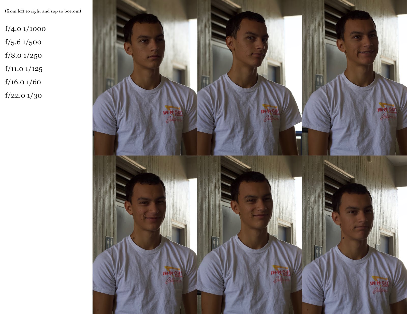
When conducting the equivalency slant charts for indoor and outdoor photos to expose the same photo with different f/stops and shutter speeds, one can certainly take note of all of the aperture changes and especially how slow/fast the shutter is at different speeds. I have a large background in exposing for the right situation, but these equivalency charts definitely helped me to understand just how risky it is to aim for slower shutter speeds when you're shooting handheld.
f/6.3 1/25
f/22 1/4
To achieve these shots, I merely had to use slower shutter speeds. I tried using the shutter priority mode, but I did not like how drastically it changed the aperture (for example, f/22 is far too small of an aperture for my liking for these photos). Choosing a moving object and a constant background proved simple and are reflected in the simplicity of these photos, but if lighting was not as available as it was on this day, I'd definitely try to play around with aperture and ISO to balance out. A tripod may have also helped.

f/18 1/40
f/18 1/80
For these photos, timing and motion of your body is essential. You definitely need your vestibular sense and kinesthetic sense to be able to "track" it with your subject, or at least moving the camera accordingly. I did not have good success with tracking a close human subject and it was quite rushed, but with a car it is slightly easier as they are more distant from the camera.

f/1.8 1/640
f/2.0 1/1250
In poor indoor lighting condition, it definitely would make sense to stretch out the capabilities of one's ISO settings to capture the images without sacrificing depth of field and shutter speed. I felt that the second photo of the two proved successful in capturing great shutter speed control and isolation of the subject (which in my case was simply trying to capture the detail in the popping/spurting bubbles).

f/2.5 1/3200 
f/3.2 1/3200

f/5.0 1/1250
Capturing fast shutter was relatively easy as you have less "moving parts" to worry about camera-wise, but more moving parts to worry about real life-wise. On this day, lighting was in great abundance, so all we really needed to worry about was how we were going to setup the action/photo itself, how we splash water onto the subjects, etc. It's less technical difficulty and more conceptual difficulty.

Overall, this project was a nice refresher mainly in the fast shutter avenue. The other exposure controls were very familiar to me, and I feel that this project proved that. I definitely hope to incorporate the fast shutter concepts into my own projects in the future as it is fun and interesting to create those kinds of images. They may prove difficult, yes, but the challenge is great and could potentially expand my range of photography beyond just portraiture and street.

Saturday, September 15, 2018

Photo2Q1.1: Best Photos

1a
1b
I enjoy taking street photography the most. I feel that people are most natural when they aren't posing in front of the camera--they are at their most genuine selves. This can usually only be achieved when they're in a particular setting. The street is the most opportune place, as there is ample lighting most of the time to achieve whatever effects I want to achieve. (1a)

In addition,  I'm not sure how to categorize this, as it is more of an aesthetic, but I enjoy taking photos that have either a very focused in and particular subject matter, or an extremely minimal setting (as shown in 1b). Minimalism is perhaps the most sought after aesthetic that I want to achieve despite the difficulty in getting it spot on. (1b)

2a
This is still my best photo from earlier this year when I was in Photo 2. I still feel that this is my best photo because everything was just captured right. I like the way I edited the graduated filter in the top right, the depth of field is spot on; everything just "works". (2a)


2b
As an effort to provide a different best photo alternative, I also feel that this recent photo for my friends' homecoming queen campaign (in which she won yay) can be considered one of my best photos for very similar reasons to 2a. Only thing I'd change is that I'd remove the black bag in the background that's there for some reason. (and yes, I know, all my best photos usually have the same model in it) (2b)

3a

3b

This year, I'd like to expand my abilities in taking photos that involves very controlled lighting. I feel that I rely heavily on natural light and using Lightroom to drastically improve my photos from their raw state. Although it is definitely advantageous to use the tools you have, the point of having such remarkable technology is to use them when you can't achieve them in real life with ease. I'd like to be able to become a more flexible photographer, and I feel that challenging myself with controlled lighting would be a great start. (3a, 3b)

Sunday, May 20, 2018

Photo1Q4.34: Q4 Final Best Photograph

This is a thumbnail


My original best photo was of a model that I was shooting alongside a friend who needed some assistance for the magazine she interned for. I think this photoshoot best defined the direction I needed to head in in order to improve, and that's getting out of my comfort zone. I rarely did portraits outside of this photo, and always shot landscape and objects and such. Sure, it's possible to make a career out of it, but I never knew how much I enjoyed doing portrait photography in contrast to everything else that I'd been doing beforehand. In addition, this photograph truly tested my capabilities in terms of Lightroom, and has shaped my skills to what they are today.

Old best photo
This is why, as a renewed photographer since that moment, I feel that I've transcended into new clouds. Obviously, there will be something greater that I could do. There's a lot of different things I'd do different with this photograph, for example. There's a lot of different things I'd do with other photos too, even my new best photograph.

New best photo
I know I post from this particular photoshoot (and of this particular model) quite often when I mention my projects to anyone, but I truly believe that this photo captured all of my skills effectively. The exposure is just right, I love the depth of field with the 50mm lens that I used for this, the color palette is very nice (green shoes, green court, blue shades, etc.), and the framing is really nice as well. When I edited this, I went for a warmer temperature to compliment the sun in the background and purposefully blew out the exposure in the back using the graduated filter tool in Lightroom. The hair received a nice bit of that filter which helped to show even more with differentiating foreground and background. Finally, the model is one of my best friends since middle school. Shout out to Jasmine Chee :).

Free choice
This photo is out of focus, but that's what I like about it; it's so "raw" without so many imperfections other than the focus. It's interesting. Would've been a heavy candidate for best photo if this was in focus though.

Free choice
This photo has more sentimental value than anything. The bracelet meant a lot to me, and it's paired with some of the best music I love (as well as one of my closet hobbies, collecting CD's even though I pay for Apple Music $10 a month). I like the aesthetic of this photo. My hand just looks really weird in this.

Free choice
I also felt that this photo had one of the best 'production value' out of any photograph I made with a group. As in, if this were for a poster or for something I was commissioned for, I'd definitely be proud to submit this. A lot had gone into making this photo really nice, and Noah Maldonaldo was really great at capturing the emotion of creepy perfectly. I don't necessarily enjoy this aesthetic because it's not really my style or theme at all, but it still was a really great photograph.

Photo1Q4.33: Macro Magic

Lens reversal, taken in class, photo of Noah's eye
True macro lens, taken in class, photo of dice
Macro mode/setting, taken at home, photo of RAM
Free choice 1 (true macro lens), taken in class, photo of $5 bill
Free choice 2 (macro mode/setting), taken at home, photo of fur hat
The objects in which I attempted to photograph definitely ranged in size, though I would've liked to photograph much more complex and contrasted objects instead of the ones I selected because of their dull textures (and it shows through the final images selected for each category). Thus, finding the sweet spot for each of the images proved to be quite difficult since the textures were quite dull. I took risk in doing this, and unfortunately did not pay off too well.

The most difficult part of photographing macro objects probably is the selection of objects. There are particular objects that will look amazing under a macro lens, especially objects that don't reflect too much light and has a lot of little parts to it. Eyes, certain flowers, certain living things, dollar bills; all of these objects are "crisp". They have a certain sharpness to them. Some of the objects I used don't look so great under a macro lens or using macro methods (fur, arguably the dices too) because they're too "perfect" to have contrasting lines and such.

Of the three methods, I felt that a true macro lens far exceeds the level that the other two methods could reach, and thus was able to contribute better to this assignment. This is simply because the lens is legitimately dedicated to macro photography, and all of the little quirks of the other methods are essentially removed. 

Tuesday, May 15, 2018

Photo1Q4.32: Me Mask

Studio 1
Studio 2


Compared to other projects, I felt that I took this one not as seriously, which is reflected in the quality of the mask. It's alright, but it's not "amazing". In comparison to other group assignments, I feel that it was a nice freshener from always working with the same group of us boys in class all the time (but we ended up doing it anyway when photographing each other).

I feel that the silhouettes project was most effective in preparing me for this self portrait project because of the thought that you must put into the set-up, through the mask, pose, clothing, etc. With this project, I truly needed to convey what I wanted to convey through how my mask was designed, and how I posed.

Studio 3
Reflecting on this project, my design was influenced by some photos I found on Pinterest, as well as some fashion magazines that were on the more radical side. I originally wanted to use netting as the main material, but it proved way too difficult to manipulate. Venturing more into my inspo, I found that foil was a perfect reflection of who I am and was an easily replicable material to incorporate. I like to be a reflection of other individuals, taking the best aspects of them and incorporating them into my style and mentality. For example, I like Kobe Bryant's "mamba mentality", but I also like one of my friend's style of photography. Two entirely different professions, but nonetheless incorporated into my lifestyle. Foil is reflective, taking in light and reflecting it back; a perfect metaphor to what I want to convey. The mask itself wasn't how I wanted it to turn out, but it gave the same message; half of myself is my true individual self, and the other half is a reflection of other individuals.

BTS

When making the mask, I used an Aeropostale bag cut out, a hole puncher, foil, an X-ACTO knife, and elastic band. The process was very simple; cut out the mask, attach elastic, glue foil, and I'm done.

Location 1
Location 2

As for the background, I chose to use the wall with all of the holes outside F302 for the location shots because I found that the metaphor for them was particularly interesting. They are a filter to the light, much like how the mask is a filter to my face, and even moreso how my inspirations are a filter to me. I chose black for the studio shots mainly because they seemed to match the mask better. Honestly, either color worked (as shown through my studio shot where I hold up the mask).

I feel that this project would've been less comfortable if it were just a self portrait project because the mask is a nice filter. The focus of the image is mainly put on the mask, and that relieves some tension on facial expressions. It still provides a challenge through all other aspects of the photo, however, which is good. I feel that this mask did convey parts of my identity decently, though I would've liked to make it far more diverse. Perhaps using a real plastic mask as a template, maybe adding something interesting to it (like a floral pattern), etc. would have turned this project around.

Photo1Q4.31: ITSO Project

To preface this post, I really did want to use a female model to replicate the photos shown below. However, due to health complications, that model was unavailable for the window in which I had to shoot with. Thus, I just used myself for both photographs.

First rendition
First original
This first image was originally shot by Robert Doisneau. My research did not show any specific time or title, so this first image is untitled. Robert Doisneau was a French photographer who lived a long life from April 14, 1912 to April 1, 1994. He was, according to Wikipedia, a "champion of humanist photography and with Henri Cartier-Bresson a pioneer to photojournalism". I have to agree, because as I was going through much of his work, he was essentially what people today call a street photographer. I enjoyed looking through his Paris photos especially because of how raw and true to the city they were. He knew how to capture moments, and what was appropriate to that moment in terms of camera manipulation. I'm assuming that the image above was on the more staged, creative side, however, I chose this photo because I did want to challenge myself for this project (though, as shown in the introduction, my plan needed a lot of improvisation, so I had to make some adjustments).

My final rendition shot focused on A) outfit and pose, B) backdrop, and most importantly, C) ghost effect. I did not have a ribbed shirt anywhere close to the outfit depicted in the original, but my white sweater did have some similarity in terms of contrast and pattern. It's not the most similar, but it's better than a black shirt or anything worse. When folding my shirt to replicate the bottom, I found it really unattractive an displeasing because the leading lines in the original played a role in making the shot nicer. My shirt did not have such lines, so I elected to not twist the sweater in that fashion. My pose was relatively the same, but I would've liked my face to be slightly more straight on instead of off in the distance. The backdrop is a simple black wallpaper I found at Fishers. Finally, the ghost effect needed some manipulation and testing, but I was able to find that an exposure time of 1.3 sec was good. The light is not exactly the way I wanted it, but my lamp could only provide so much power. I would've like the light to illuminate the shadow of my ghosted face better though.

BTS with makeshift stand
My view when up against the backdrop
Backdrop itself
How I attached it to the closet door
I don't think I did amazingly well on this photo, but I did well in the sense that I used what I had in order to make a photo that wasn't absolutely subpar.

Second rendition (1)
Second rendition (2)
Second original
This second image was originally shot by Man Ray in 1932, titled "Tears" for obvious reasons. Ray was tied to the Dada and Surrealist artistic/cultural movements, and lived a long life from August 27, 1890 to June 16, 1976. He was an American artist in film, painting, and photography. I enjoyed much of his work as well. Some of his pieces really do reflect the surrealist movement he was a part of, and definitely created some unique photos. I actually think this was one of his more simpler photos, yet despite that, I could never grasp how he was able to create such perfectly round tear drops. Thus, I chose this photo as part of this project.

My final rendition focused on 1) pose, 2) editing, and 3) tears themselves. I knew that post-production would have to play some role here in order to make this photo, but I didn't expect to make so much edits to this photo. It's very unfortunate, how they all turned out. The tears seemed to run down so quickly down my face, because I basically had to pour real water drops onto my face, pose and refocus the camera, and shoot with both hands on the camera as my face looks up the entire time. I used post-production to remove a lot of the facial imperfections I have, as well as to brighten up the tears themselves to give them contrast. I feel that this photo could have been a lot better, because in retrospect, water didn't have to be used. Something more adhesive to skin, for example, could've been a much better candidate (like something more syrup-like and stickier).

The syringe-like tool I used to drop water onto my face (don't worry, it's clean)
How I attempted to drop it onto my face (I used the mirror basically)
The method in which I used to photograph myself as my camera does not have a rotating LCD
Overall, I definitely could've done better and come more prepared. The biggest challenges I had during this was dealing with not having a model after planning it for that model in specific, as well as attempting to improvise. Supplies were not a struggle, but the diversity of supplies could've been better. Perhaps looking for a better dropper, or a better solution to drop onto my face that was more adhesive for the second photo would've improved the quality and realness of that photo. These images were fairly moderate in difficulty, so it's unfortunate that they turned out the way they have, but it is what it is.

Comparison of all of them side by side:


shimabukuro photos © , All Rights Reserved. BLOG DESIGN BY Sadaf F K.